When Avi Lasko and Noah Lasko came to us to chat about their kosher food production business, they weren’t asking for “a logo.”
They were asking for something harder, more robust. They were looking for a brand that felt modern, memorable, and instantly more understandable without losing credibility in a category that’s built on trust.
At the time, the business lived under the names LC Food Group and LC Food and Events. Internally, that made perfect sense. “Lasko Catering” Food Group, it doesn’t get more streamlined than that.
Externally? It didn’t really help anyone picture what they did, how broad their capabilities were, or why they should be the team you call when you need kosher food executed at scale.
And that’s the moment we love. When the “logo request” is really a request for clarity.
So we kicked off what became an 8-week identity sprint—equal parts strategy and design—focused on two goals:
From day one, Avi and Noah were clear about one non-negotiable:
The brand needed an icon that could stand alone and grow into something recognizable over time.
Kosher Eats is a Florida-based kosher food manufacturer serving institutions and organizations of all sizes that feed people at scale. Places like:
They also have a significant catering arm of the business (which matters, because catering has a completely different vibe than large-scale manufacturing).
If you’ve ever worked in food, you know the challenge here: one side of the operation needs to signal consistency, compliance, and reliability, while the other needs to feel elevated, curated, and event-ready.
The name “Kosher Eats” wasn’t a given when we started down this road. In fact, we were still designing with LC Food Group / LC Food & Events in mind.
So Version 1 was about exploring directions more than polishing “the” answer. We were testing:
Some early concepts leaned more playful or illustrative. Others were cleaner, more emblematic, and more “system-ready” for packaging, decks, and signage.
But the most important thing Version 1 did was help Avi and Noah react to real options instead of the hypothetical preferences we had talked through in our discovery calls.
Because it’s easy to say “modern.” It’s harder to define “modern” until you see three versions of it sitting next to each other.
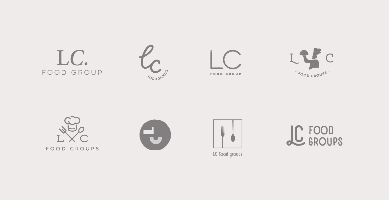
One key learning from Version 1:
Avi and Noah were drawn to ideas that felt iconic. Something stamp-like that could live on a label, a hat, a fridge, or the corner of a sales deck and still feel intentional.
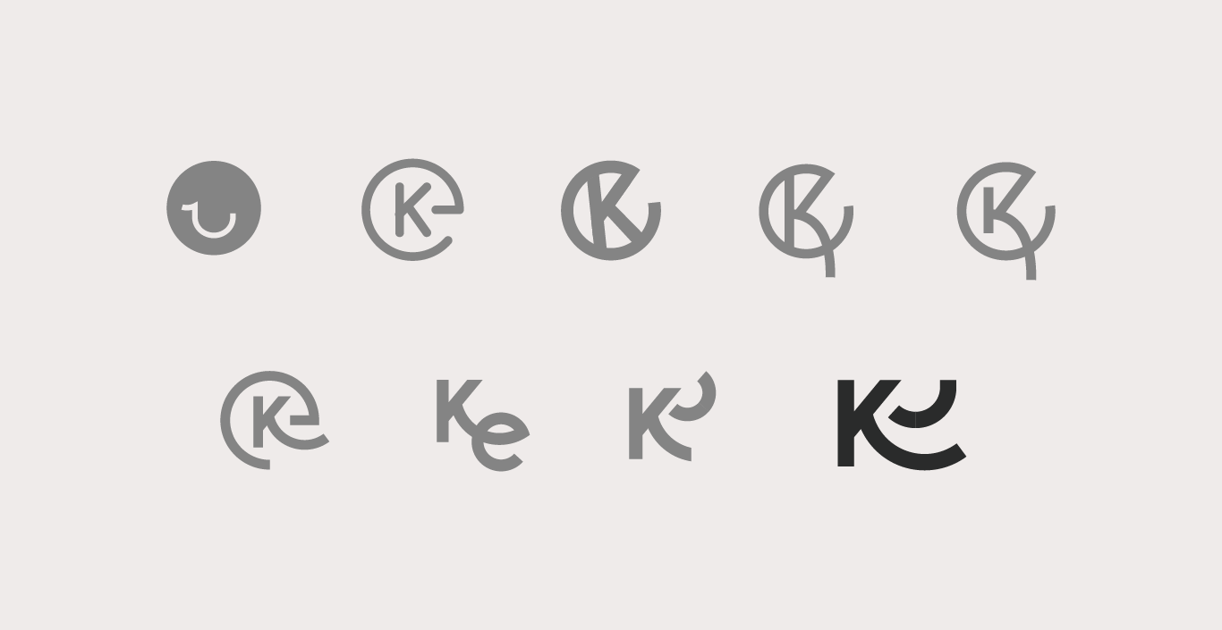
Version 2 is where things really started moving. After pitching Version 1, we settled on two things.
First, the team started leaning into the name “Kosher Eats,” recognizing that even though they make their sales from a B2B standpoint, there is still an end consumer that needs to see the product as exciting.
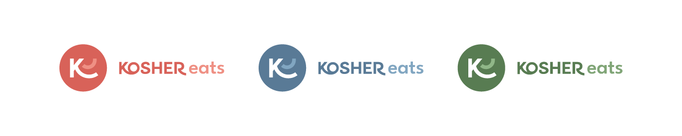
Second, we began separating the identity system into two connected, but distinct, brand expressions:
This wasn’t a decision made to have a couple of cool names. It was a decision made to create some brand architecture.
If you try to make one logo do everything, it usually ends up doing nothing particularly well. And if you have a vibrant, playful logo, it doesn’t quite represent the high-end catering and event planning side of the business.
So we built Version 2 around a clearer brand story:
And this is also where we introduced one of the most functional parts of the system:
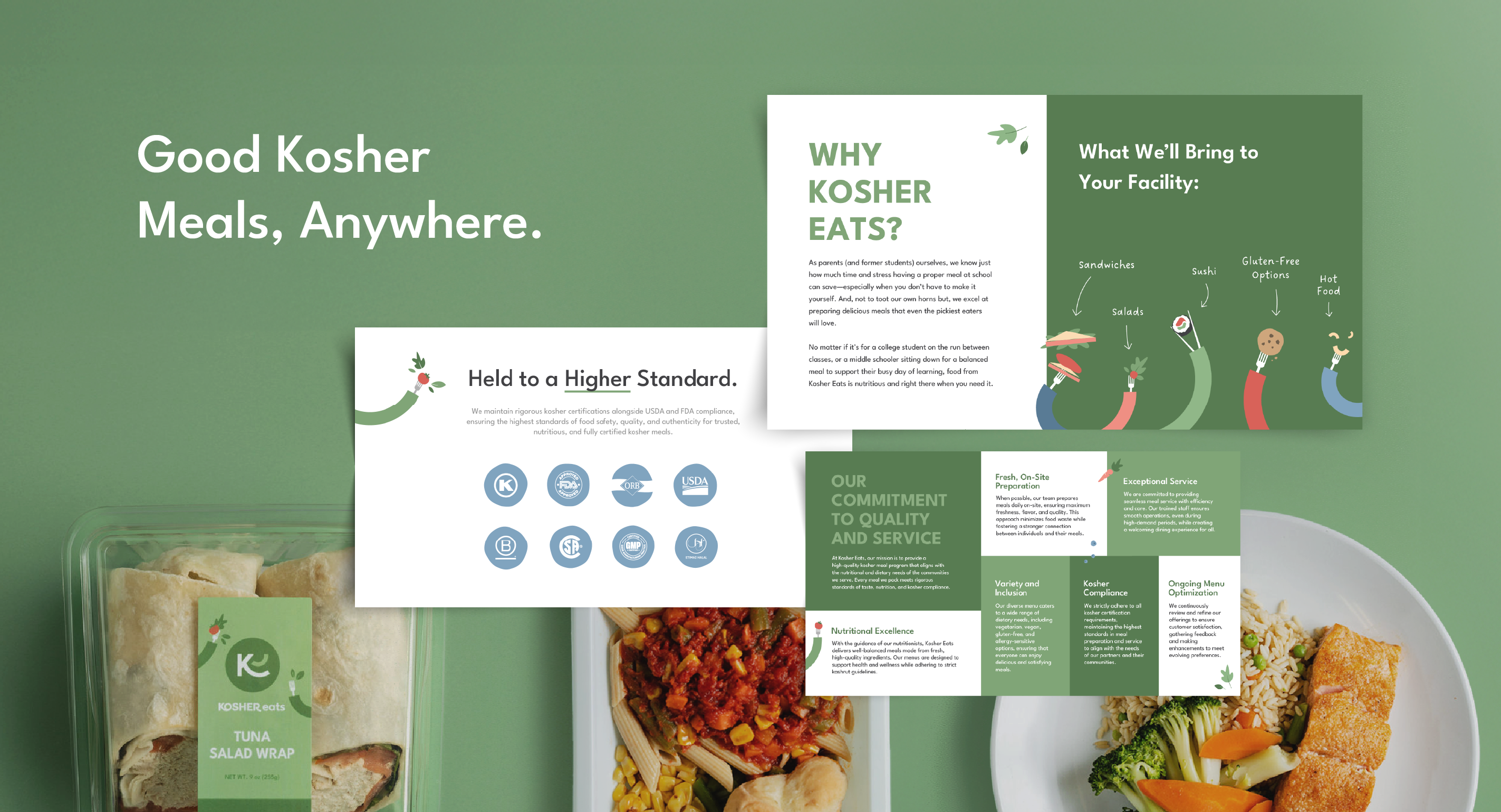
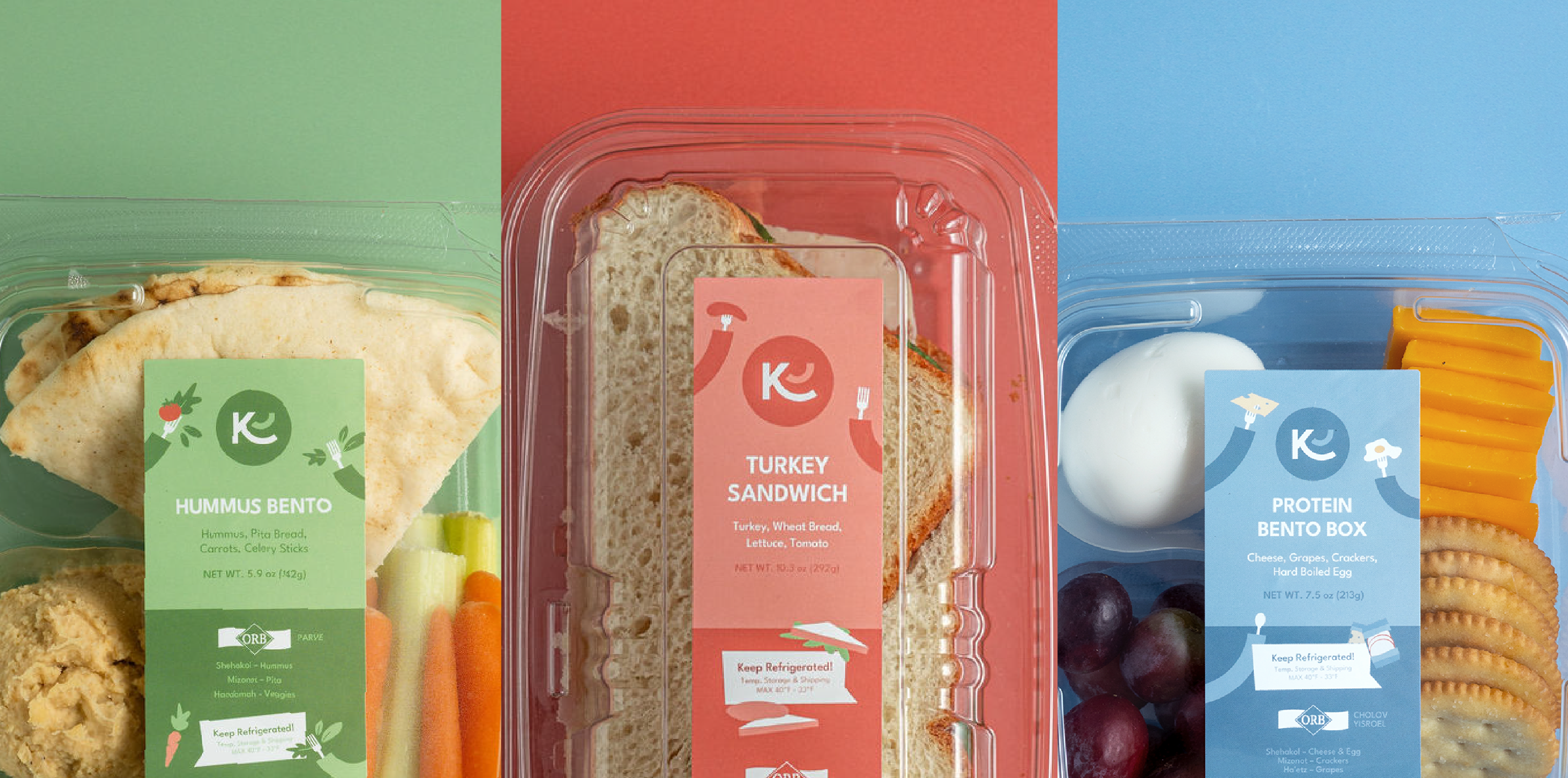
Kosher Eats needed branding that wasn’t just pretty—it needed to help people make decisions. So we created a three-color system to reflect their menu categories:
That color language becomes a quick visual cue across packaging, labeling, and internal materials. It’s simple, but it adds up fast when you’re producing a high volume of items and need the brand to work like a tool.
This is the moment Avi and Noah realized they did want to go a bit more “kosher forward.”
At first, they weren’t sure. They didn’t want the brand to feel overly religious or niche. But one of the early icon directions—one that subtly echoed the visual familiarity of an Orthodox Union-style kosher symbol—kept pulling them back.
It wasn’t heavy-handed. It wasn’t literal. It just felt right.
And when a mark feels right and it works across mediums, you pay attention.
The final decision wasn’t made because the logo was the “coolest” or any other metric like that. Avi and Noah came to choose the logo because they felt it could actually become a recognizable shorthand for the brand.
Two quotes from Avi and Noah basically sealed it:
This final logo checked every box we set at the start:
Their brand was designed to stick.
A logo isn’t a brand. It’s a symbol for one.
So once the mark was approved, we moved into the part that actually makes the work feel real: application.
This is where the brand system started showing up in ways that help Kosher Eats operate, sell, and scale:
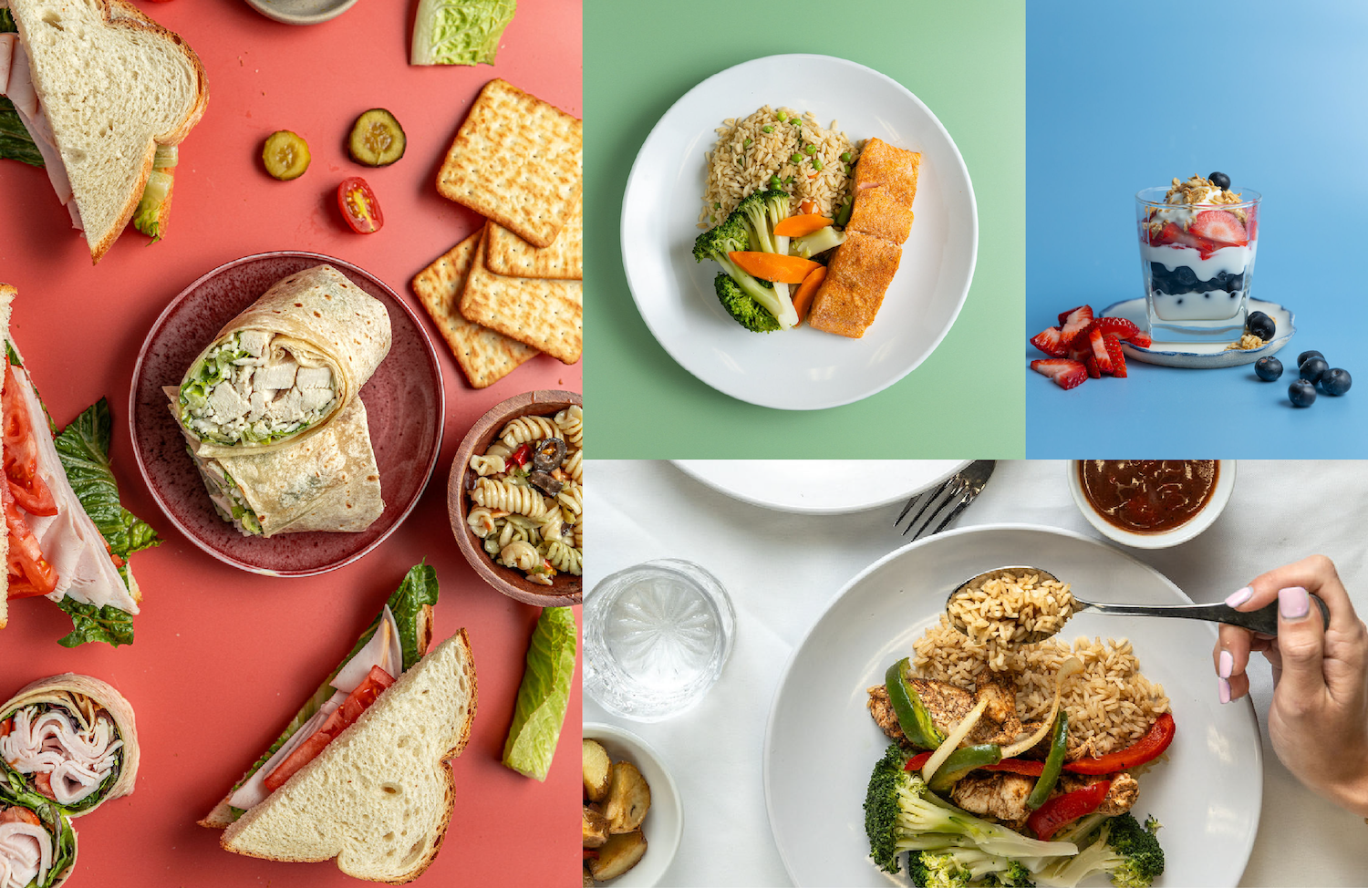
Food brands live and die by visuals. We built direction around:
And once the photography came in, the brand immediately felt like it had a world.
Kosher Eats sells into institutions and large organizations—meaning a pitch deck isn’t optional. It’s a core sales tool.
So we built decks that:
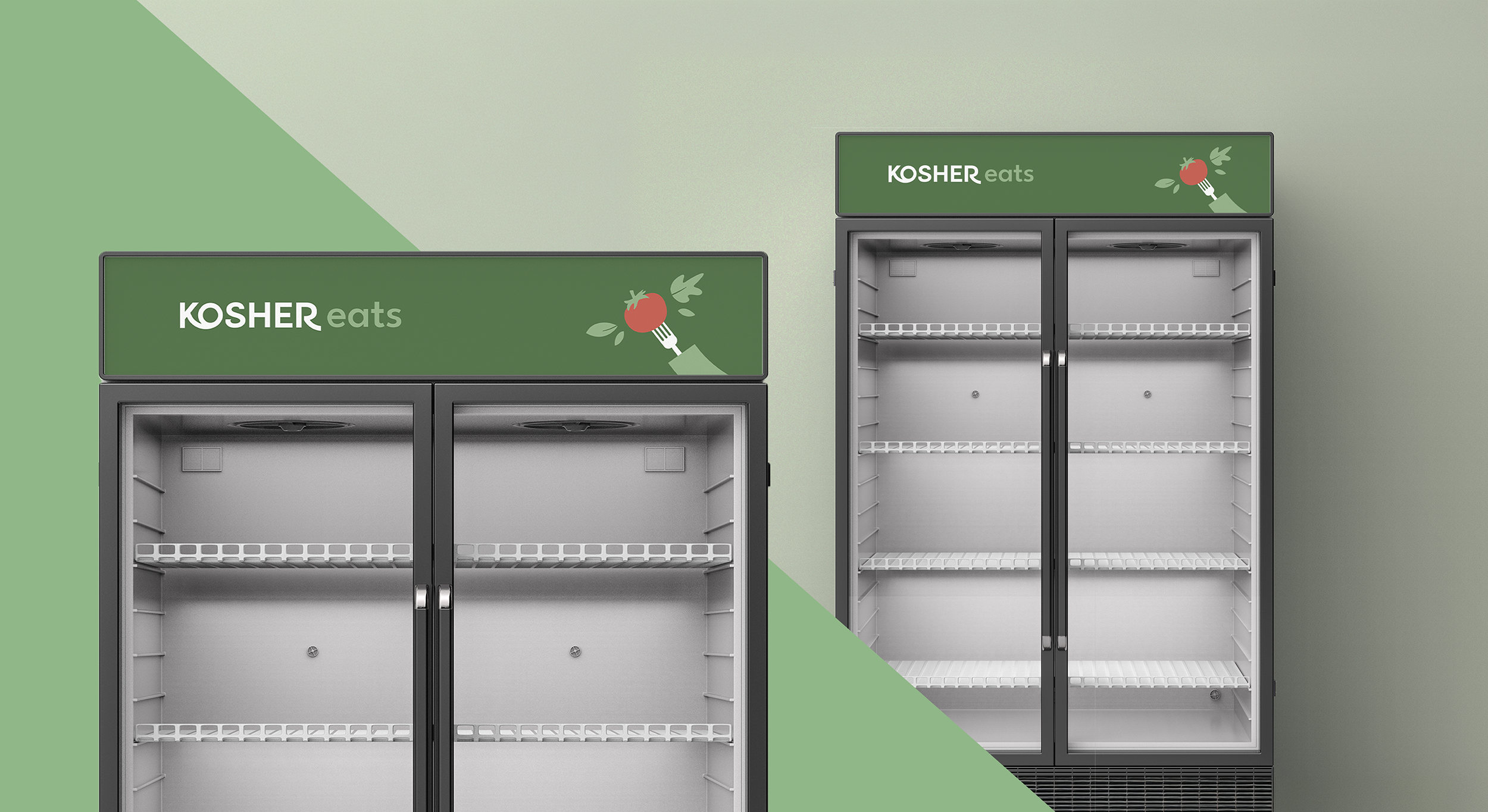
This was a big one—for them and for us.
When your brand shows up on physical equipment (like a fridge wrap), it becomes part of the environment. It needs to feel bold, legible, and consistent from across the room.
The icon and color system were made for this kind of scale.
Even at an early stage of label work, the brand system proved its value. The 3-color approach was more than just branding, it helps the consumer find their way.
Because of the system, people could recognize categories quickly, helping the brand look organized and intentional across product lines and marketing channels.
This project is one of our favorites because it’s a perfect example of what identity work is supposed to do.
It wasn’t solely about making their business look better, but allowing it to be more easily understood. Easier to remember. Easier to present confidently.
Kosher Eats came to us for a logo, so we built them a foundation. A system that can scale with them, flex across offerings, and show up consistently whether it’s on a pitch deck, a fridge wrap, or a hat.
And yes, we still love that hidden “e.”
If you’re building a brand (or reworking one) and you know you need something more modern, more memorable, and more system-ready, we’d love to help.

Proudly Based in
Evanston, IL
1744 Oak Avenue
Evanston, IL 60201


